

The Life You Build When You’re Not Paying Attention
I have spent most of my life paying attention to food, although not always for the reasons that make for
The Life You Build When You’re Not Paying Attention Read More »

I have spent most of my life paying attention to food, although not always for the reasons that make for
The Life You Build When You’re Not Paying Attention Read More »

I am keeping FaceTime, my treadmill and the air conditioning. But I have begun wondering what else disappears when we make ordinary life easier—and whether any of it deserves to come back on purpose.
Case File 012: What Are You Paying for Convenience? Read More »

A caffeine study sent me looking for a fat-burning advantage. What I found was a better way to decide when health information actually deserves our attention.
Case File 011: Does Every New Health Study Need to Become Another Rule? Read More »
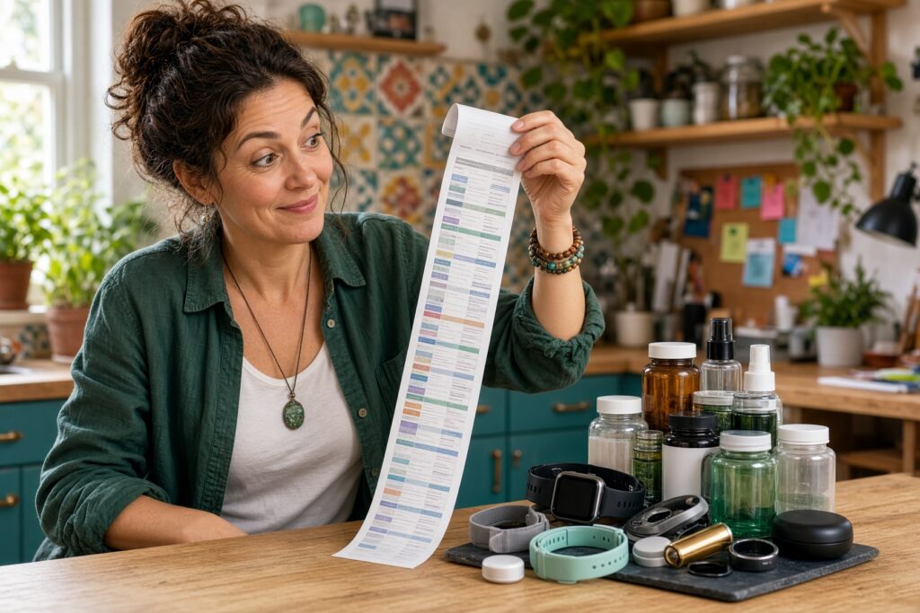
What deserves your attention and what can wait.
Case File 010: The Longevity Hype Test Read More »

What are we actually giving someone when we make them feel seen? A brief encounter with a stranger may reveal that depth requires less information—and much more attention—than we assume.
Case File 009: Watch Their Eyes Read More »

What changed when I stopped treating movement like an appointment and started letting it live inside my day.
Case File 008: I Finally Learned to Exercise by Stopping “Exercising” Read More »

Why capable people can have the hardest time stopping—and why discernment may matter more than another round of improvement.
Case File 007: The Life-Changing Power of “Good Enough” Read More »

What happens when the system, protocol, metric, or expert we hired to help us quietly becomes the thing we start serving instead?
Case File 006: Who Is This Supposed to Serve? Read More »

A reference range can be useful without being the whole story. The harder question is what changed in you—and whether the tests we ran were designed to explain it.
Case File 005: Why You Feel Off in Midlife Even When Your Labs Are “Normal” Read More »